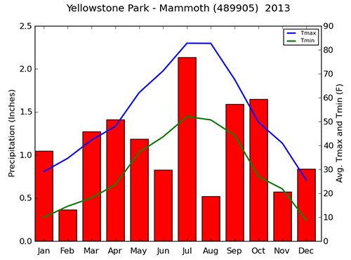
Above: Monthly precipitation, average daily maximum temperature (Tmax) and average daily minimum temperatures (Tmin) during 2013 at Mammoth Hot Springs.
The Climate Analyzer creates custom graphs and tables from weather station data, satellite imagery, and other climate data sources. The data are updated at least every 24 hours -- or more often in some cases. These summaries are calculated dynamically, which means that they don't exist until someone requests them. You tell the site which years or months you are interested in and it calculates averages, totals, or other summaries to fit your needs.
There are two ways to use the site: (1) The Climate Dashboards and (2) the more detailed queries and graphs that can be accessed from the maps interface. The dashboards give you an easy selection of popular graphs and tables, as well as current weather conditions and forecasts. Rather than asking a lot of detailed questions, the dashboards give you a lot of information with just a few clicks. They look like this:
Above: Monthly precipitation, average daily maximum temperature (Tmax) and average daily minimum temperatures (Tmin) during 2013 at Mammoth Hot Springs. |
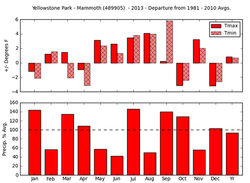
Above: Departure of 2013 average minimum, average maximum daily temperatures and precipitation from 1981 - 2010 at Mammoth Hot Springs. Missing bars (NA) indicate months in which there were insufficient data to calculate an average or a total. |
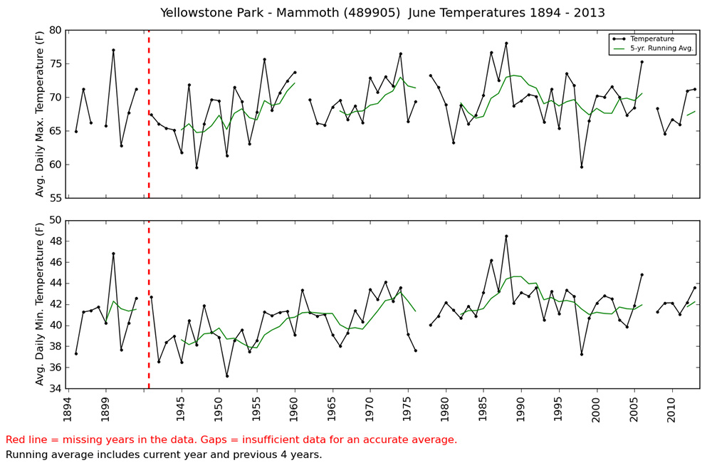 Above: June average daily maximum and minimum temperatures during 1894 - 2013. Blanks = insufficient data for an accurate average. |
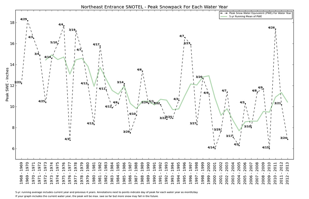 Above: Peak Snow pack (water equivalent - inches) for each water year 1969 - 2013 at the Northeast Entrance of Yellowstone National Park. |
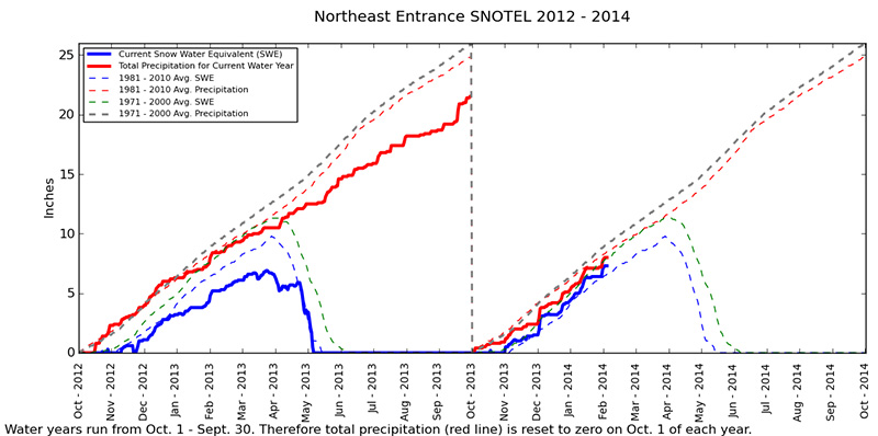 Above: Daily measurements of snow water equivalent (SWE) and precipitation from Yellowstone's Northeast Entrance 2012-2014. Values are compared to averages from 1971 - 2000 and 1981 - 2010. Data courtesy of the Natural Resource Conservation Service. |
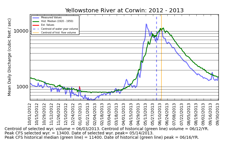 Above: Mean Daily Discharge (CFS) at the Yellowstone R. near Corwin
Springs 2012 - 2013 compared to the 1920 - 1950 median values. Data courtesy the U.S. Geological
Survey.
|
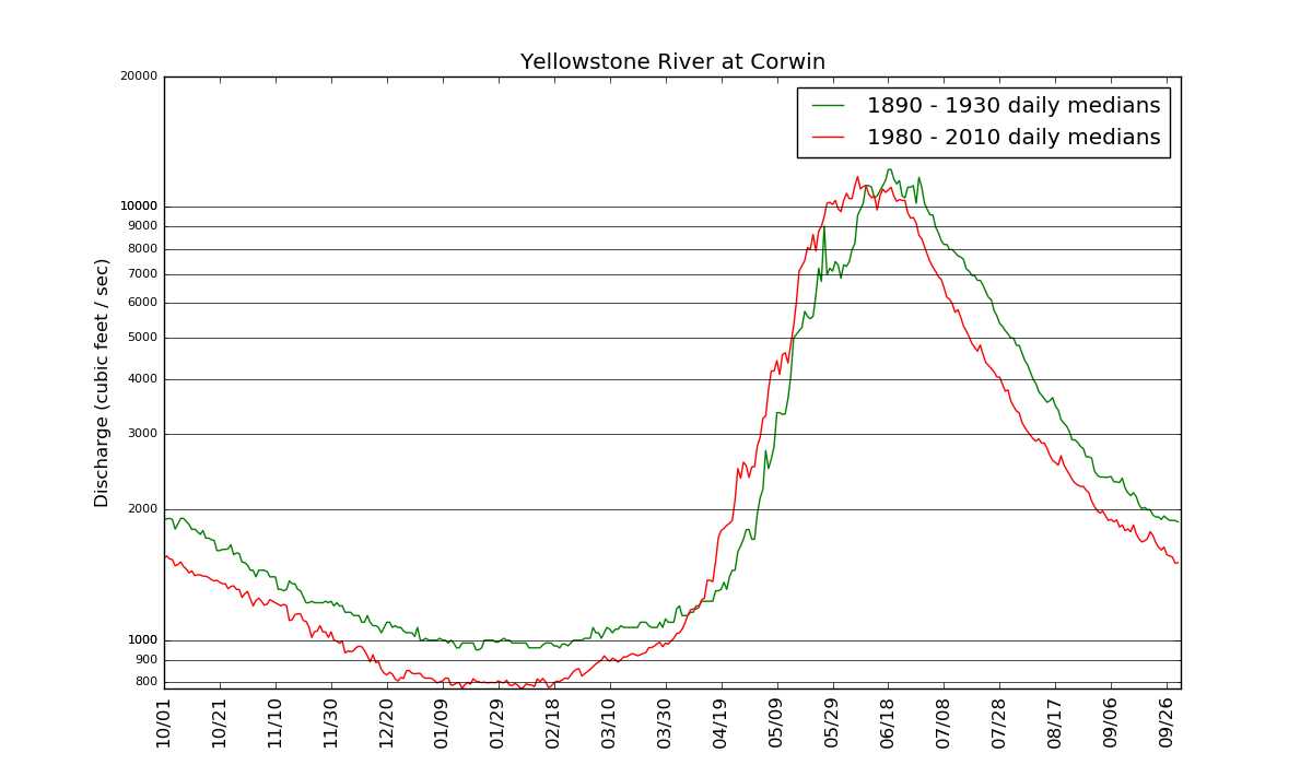 Above: Comparing stream hydrographs (flow) during two time periods. |
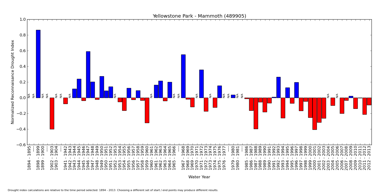 Above: The Reconnaisance Drought Index, which is a normalized ratio of Potential Evapotranspiration : Precipitation for each water year 1895 - 2013 at Mammoth Hot Springs, Yellowstone National Park. The zero horizontal line is the average for the time period considered. Red bars = years that were drier than average. Blue = years that were wetter than average. N/A = insufficient data for an accurate calculation. Dashes = groups of years with insufficient data. |
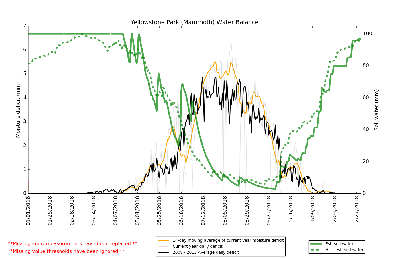 Above: Soil Water Content and Moisture Deficit calculated from a water balance model. The results for 2018 are compared to the averages for 2008 - 2013. |
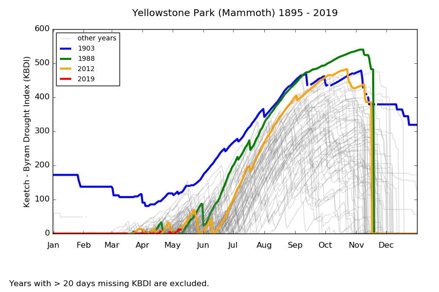 Above: The Keetch-Byram Drought Index calculated for every day during 1895 - 2019. |
Our data sources include the National Weather Service (COOP / GHCN data), The Natural Resources Conservation Service (SNOTEL), USGS (stream gages), Remote Automated Weather Stations, the Hydrometeorological Automated Data System, and a variety of other met stations and dataloggers. Even though new data arrives every day, SOME of the manual weather stations (red stars on the maps) may show a lag of a week or two before measurements are available. This is because the National Weather Service takes a while to process their data and make it available on the internet. ** It is also important to be cautious when you interpret recent data because they are often provisional and subject to change. ** In other words, if you are looking at data from just a few weeks ago, expect that some of it may change as the original data providers review it and correct errors. As these corrections become available, they will be incorporated into the data available on this site.
We do not edit or change the "official" data, but we do screen out months or years that have a large number of missing values (see next section below). In addition to this official data, some weather stations on this web site have a second "corrected" data set that can be compared to the official sources. These alternative datasets were produced by National Park Service staff or contractors for use in specific research applications. They have been screened for outliers or other flaws that commonly occur in weather data. In some cases, these alternative datasets contain estimated values for measurements that were missing in the original record. **All of the tables and graphs generated from corrected (edited) data are prominenently labeled "corrected data." There is no danger of mistaking the two types of data sets. If you don't work for or with the National Park Service, we recommend that you use the "official" data sets on this web site instead of the corrected values.
Many climate data sets have missing values. At manual weather stations, the observer might not have written down an observation for a particular day. At an automated station, there may have been an equipment malfunction or a data processing error. It is important to handle missing values correctly when you calculate monthly or annual total / averages. If you blindly calculate a monthly temperature average for a month that has only 2 days of data, for example, you might get an average value that is not very representative of reality. Therefore, this web site will not display a monthly / annual total or average for a climate parameter if there is "too much" missing data. In this context, "too much" data is missing if there are more than 5 days of temperature or 3 days of precipitation measurements missing during a month. For annual total / averages, a year will be left blank in a graph or table if there are more than 15 days of missing measurements. In the case of Remote Automated Weather Stations (RAWS), which collect data more often than once/day, days which have more than 6 hours of missing data are considered incomplete and therefore "missing." After daily maximum / minimum and total values are calculated for each day, the same criteria used for daily data at the other stations (5 days temperature, 3 days precip per month, etc.) are applied to RAWS data. Because of this screening, data on this site will sometimes have more blanks or 'n/a' (missing) fields than unscreened data available elsewhere. But non-missing data is not edited by this site and will not differ from official dtaa.
This web site is maintained by Walking Shadow Ecology. We are located in Gardiner, Montana, which is the north entrance to Yellowstone National Park. Send questions or comments to: Information {at} YellowstoneEcology.com.